Visual Identity
UtopIA
01 — Overview UtopIA is a podcast about the future of AI and what it means for humanity. We developed the full visual identity — logo, color system, typography, motion, and social toolkit — built around a single creative tension: organic vs. digital.

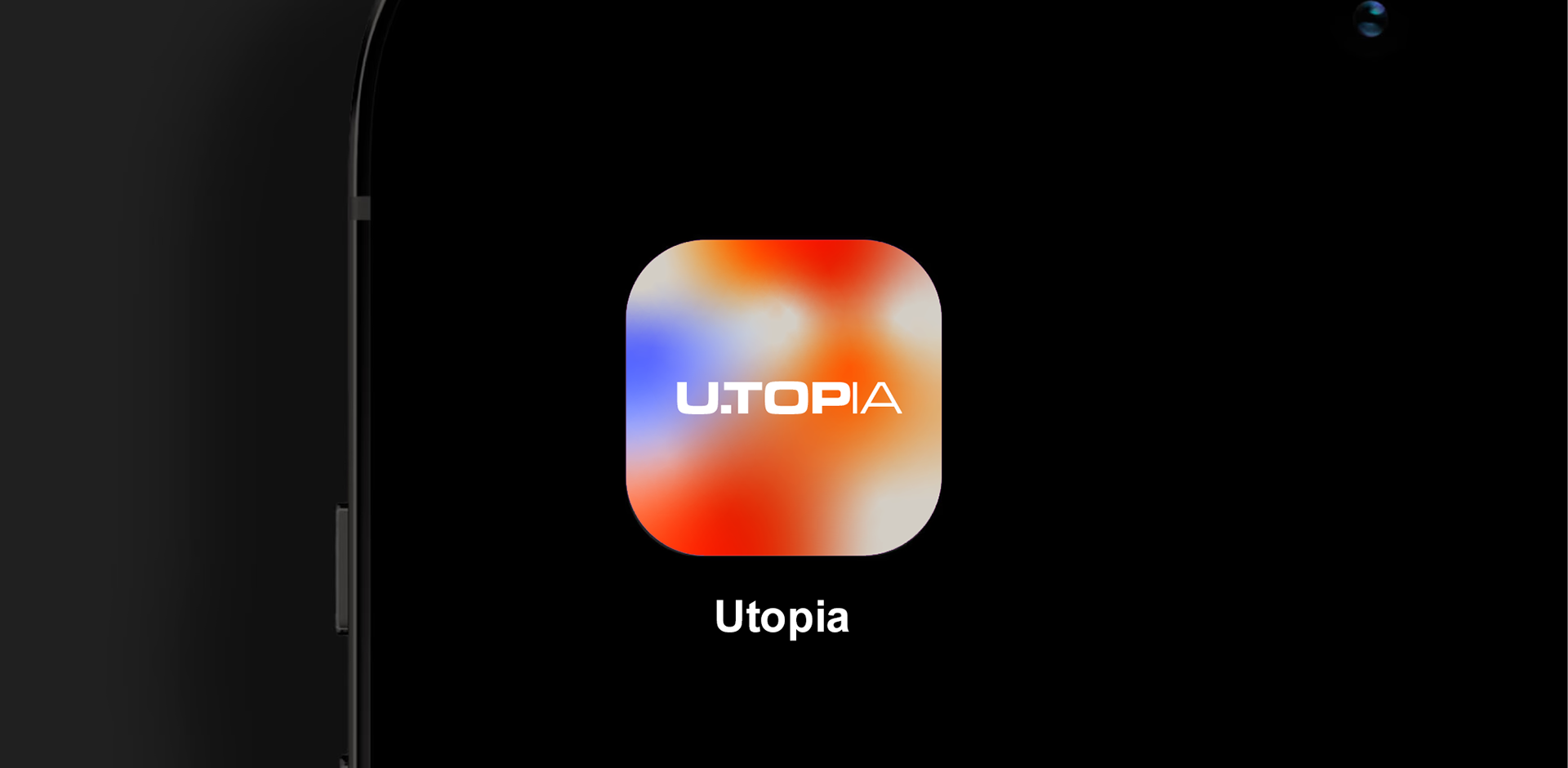
02 — Concept Alive by Design. AI is neither cold nor warm — it's both at once. The identity needed to hold that contradiction.
Animated gradients give the system its life: shifting, breathing, never static. Geometric solids ground it. The contrast between the two is the concept made visible.
03 — Visual System
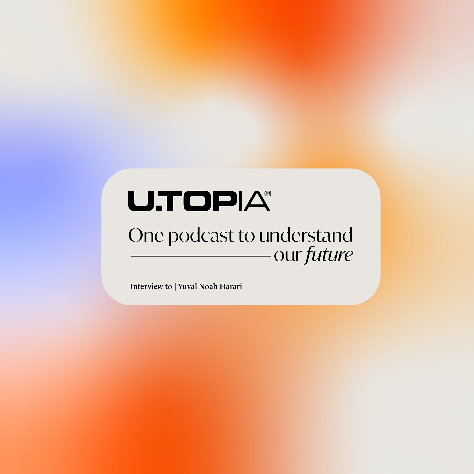
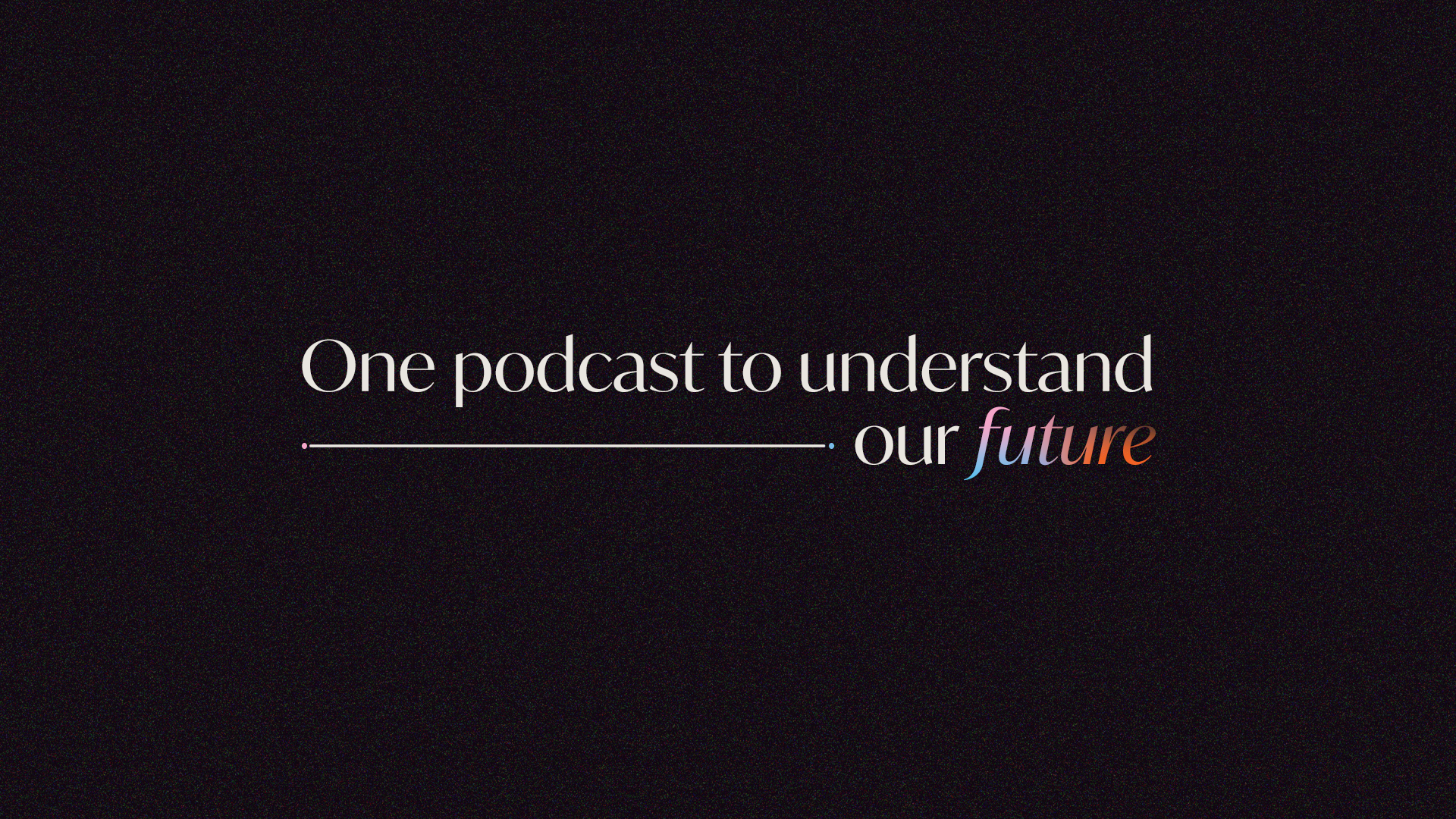
Type First, Everything Else Second
Type First, Everything Else Second
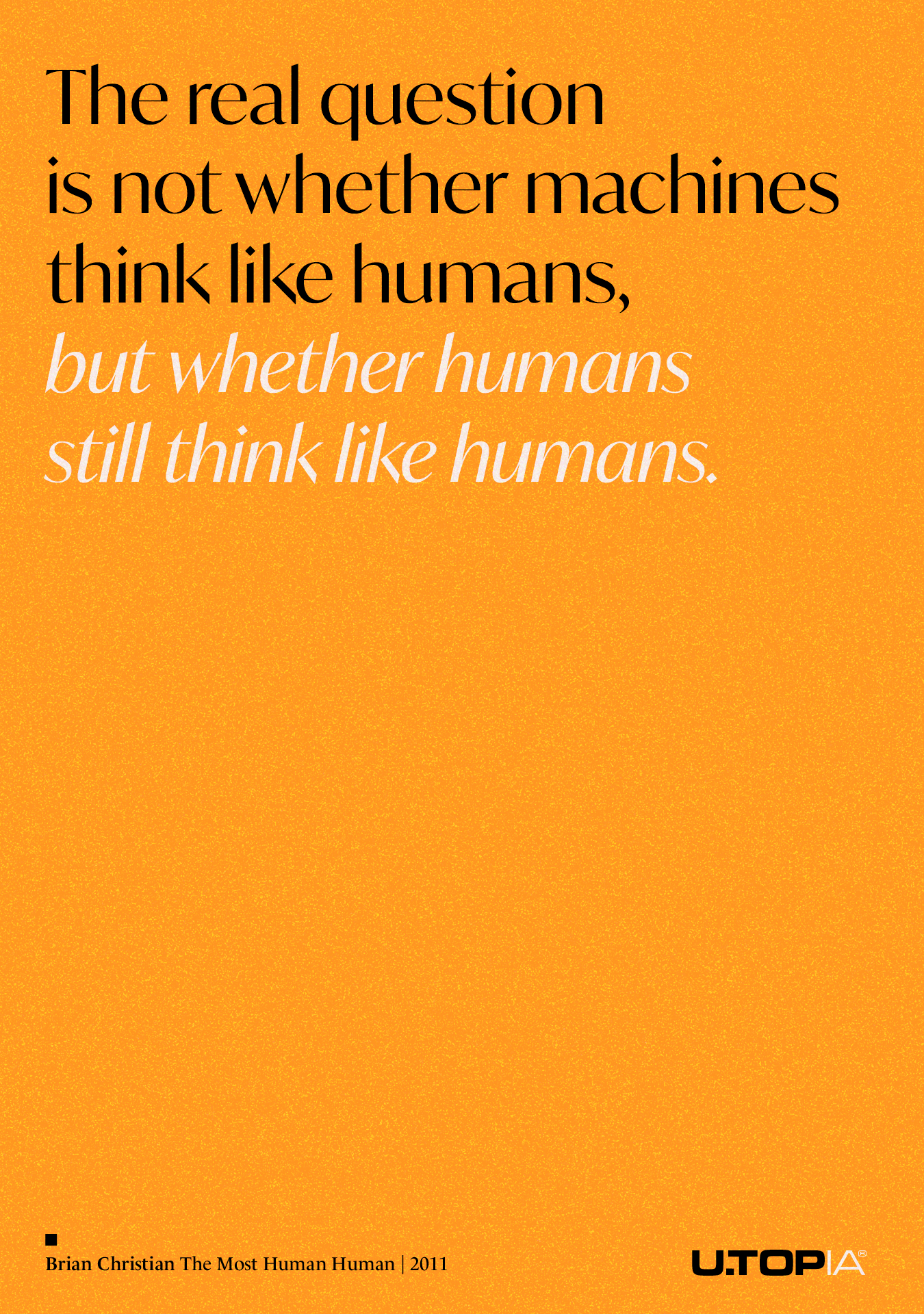
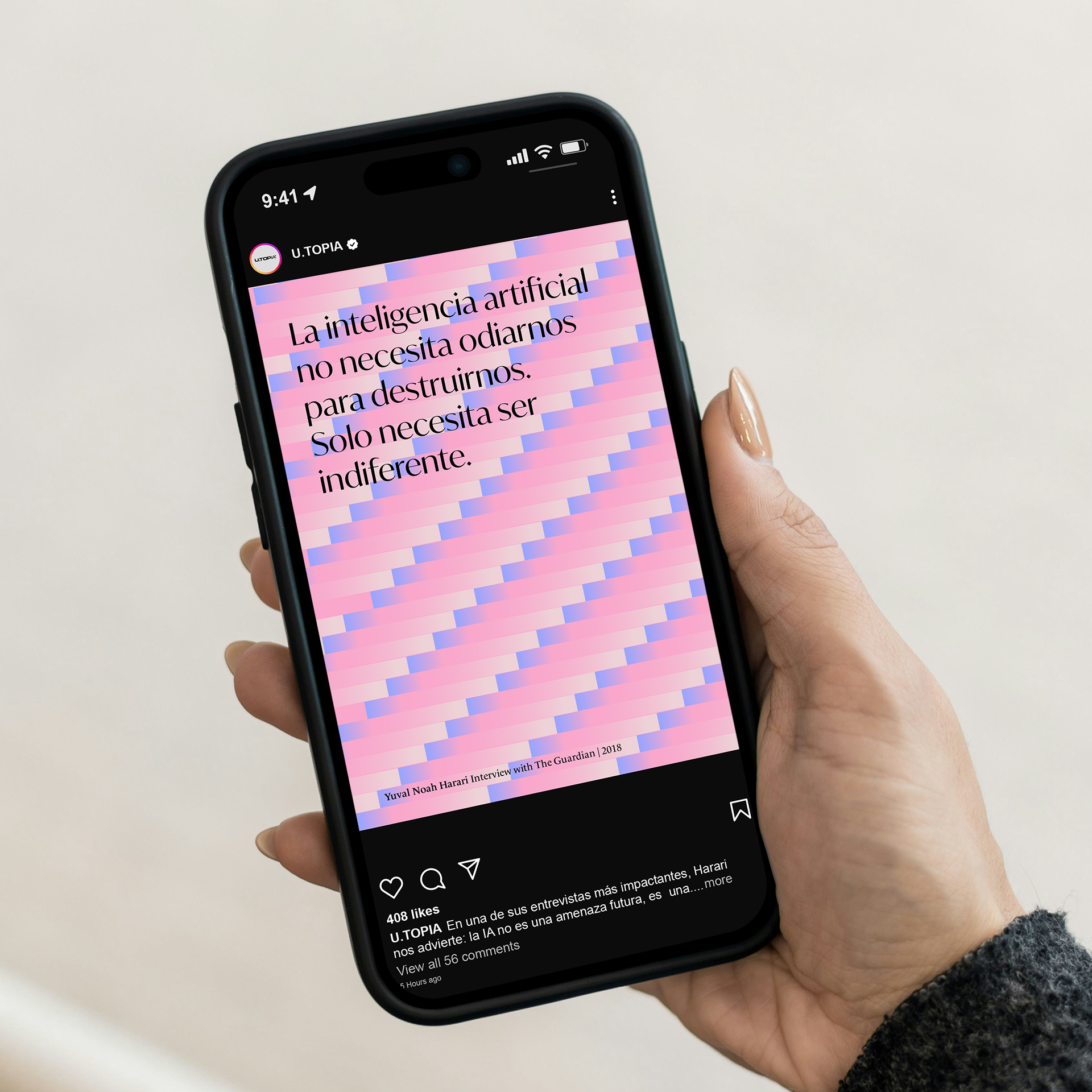
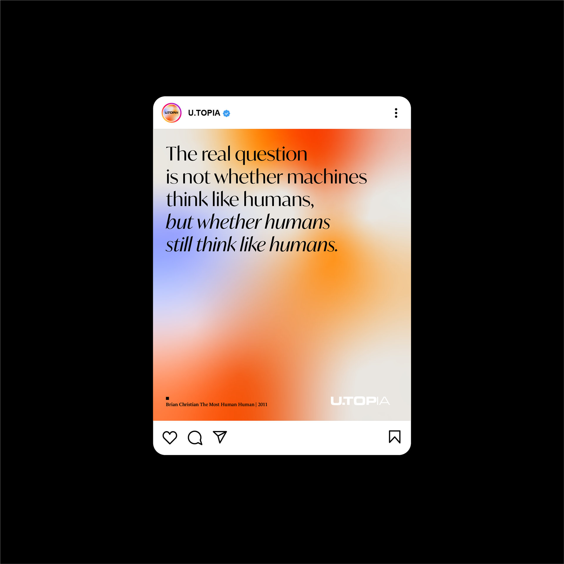
Typography is the primary visual element. It carries the message and structures every composition. Gradients and geometric forms exist to support it — not compete with it.
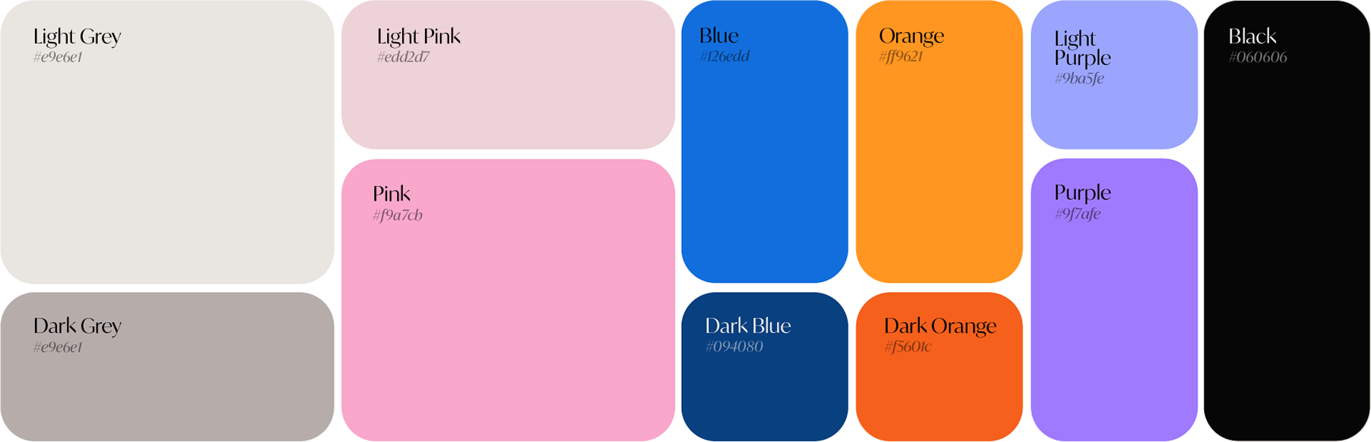
The palette moves between warmth and coldness depending on context, always through gradient transitions rather than flat color shifts.

04 — Motion Gradients animate continuously — organic movement inside a rigid geometric system. The tension between those two forces is what makes the brand feel alive without losing precision.


Client — UtopIA · Year — 2025
Deliverables Visual Identity System - Brand Messaging & Copywriting - Motion Design - Social Media Toolkit
Deliverables Visual Identity System - Brand Messaging & Copywriting - Motion Design - Social Media Toolkit